The Vienna-born poster and commercial graphic artist Hermann Kosel (1896–1983) had, since 1921, business ties with the Rikola publishing company, which was founded in December 1920 by the banker Richard Kola[1]. The novel Die gelbe Fahne by the lawyer, translator and writer Leo Fischmann (1887 – ?) for which Hermann Kosel designed the cover[2] together with Rolf Frey („Kosel-Frey“) appeared, for example, in the first year of production, 1921. (Fig. 1) It is not until a couple of years later that we find a further book cover by Kosel in Rikola’s programme. The book came out in December 1924 and turned out to be the final children’s book which the Rikola company published before its unceremonious demise: Was der Riegler-Ferdl erlebte. Ein Wiener Jugendbuch by Friedrich Kuthmayer. (Fig. 2)
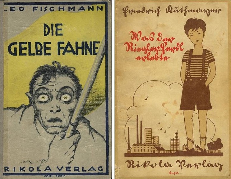
Fig. 1/ Fig. 2
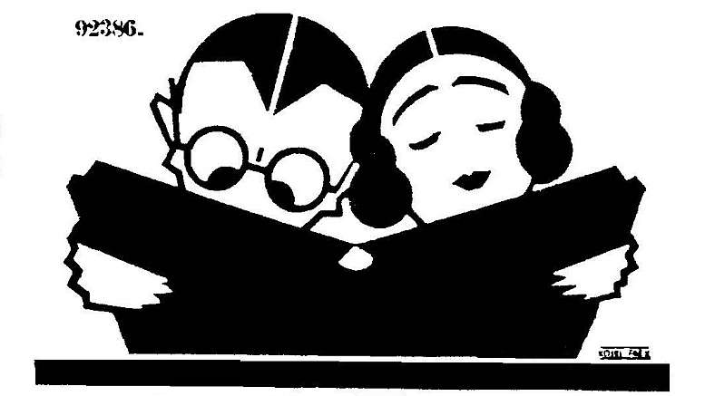
In 1923, Kosel, or his atelier, as the case may be, was commissioned by the Rikola publishing company to create a special Rikola trademark. The result came to the attention of interested legal experts in the trade in September 1923, when the official trademark register published the new company logo in the Österreichischer Zentral-Marken-Anzeiger[3].
The entry depicts on the one hand a company logo with the motif of a bow and arrow together with the letters „R“ and „V“ for Rikola Verlag – one which was to find use in numerous variations over the years – and a male and a female reader poring over a book (in this case in black and white). The trademark itself was validated on 7 June, 1923 (Fig. 3).
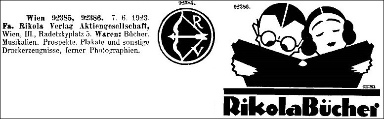
Fig. 3
Whether the logo itself, which was used for a publication in the same year (here in red and white, Fig. 4), was also designed by Hermann Kosel is unclear.

Fig. 4
The publishing house Rikola-Verlag A.G., whose literary programme focussed mainly on contemporary Austrian writers, was to experience, due to inflation and over-expansion, a number of turbulent years before it more or less ceased operation in 1926 and its broad programme was „filleted“. But that in no way meant that Kosel’s trademark for the Rikola company with the pair of readers would disappear forever from the Austrian book trade. On the contrary. But let’s first take a closer look at the variations of the 1923 trademark. We should first mention three such variations all based on the registered trademark and all featuring red and white as the main colours. The first variation is a poster in the holdings of the Wienbibliothek (the Vienna City Library) and the Museum für angewandte Kunst (MAK, Museum of Applied Art) (Fig. 5) with the Kosel-logo to the right on the black bar. The second variation was intended for use as Christmas advertising in 1923 to encourage customers to buy books from the Rikola publishing company. The caption above the heads of the two figures reads „The most beautiful Christmas present“ and just below the caption ‚RikolaBücher‘ we read „Available in all bookstores“. (Fig. 6)
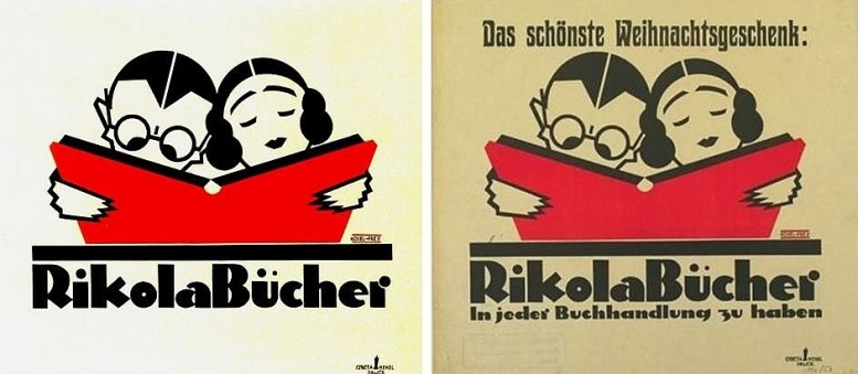
Fig. 5 / Fig. 6
Only marginal changes have been made to a third variation of the above-mentioned posters contained in the holdings of the Austrian National Library and the MAK. Here, the company name „Kosel-Frey“ has been added under the line ‚RikolaBücher‘. (Fig. 7)
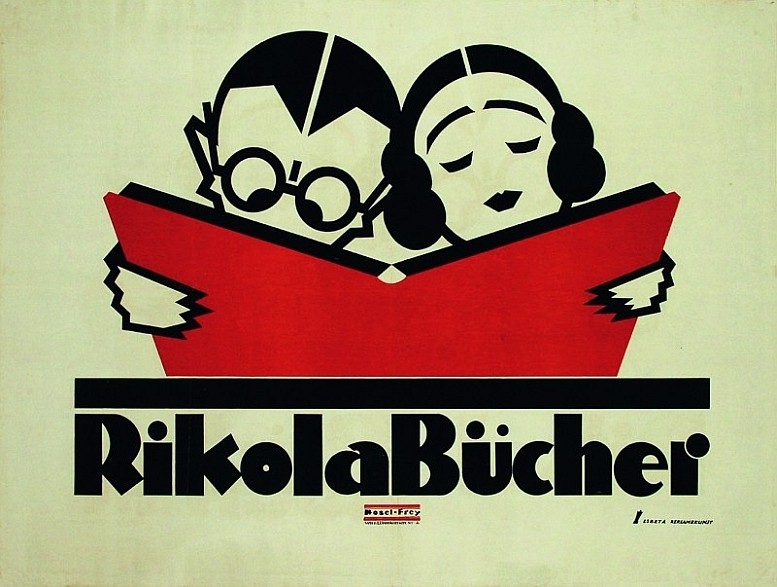
Fig. 7
More visible changes were made to the motif when the ad for Rikola appeared in the book Poster Art in Vienna which was published in Chicago in 1923 (Fig. 8, unpaginated).
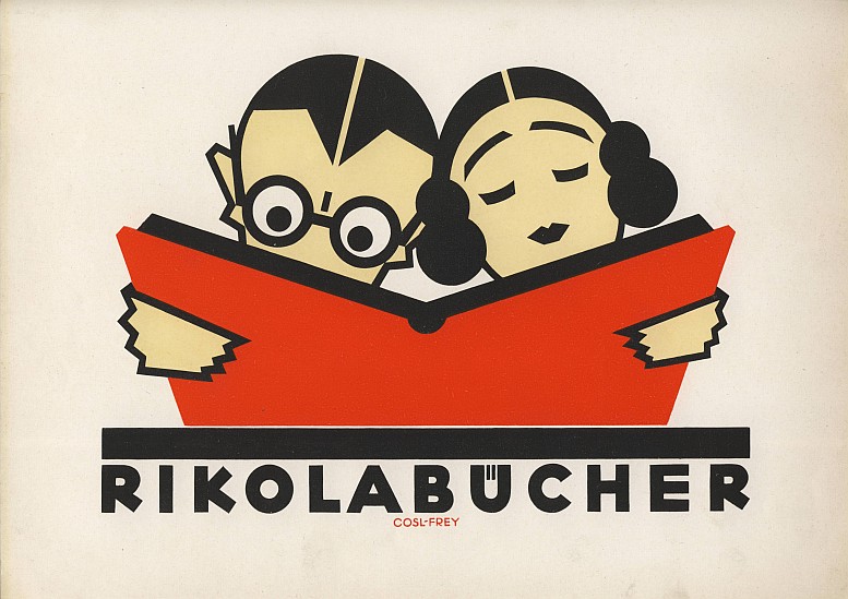
Fig. 8
First of all, the shape of the hands has been changed, secondly the line ‚Rikola Bücher‘ under the black bar is reproduced in capitals (underneath it is the name of the company Kosel-Frey in small print), and thirdly, the circular-shaped white hole at the top of the binding has been blackened, and fourthly the eyes of the male reader differ greatly from the first variation in that the figure has a more stern look. Kosel also „retouched“ the glass frames and made them somewhat thicker.
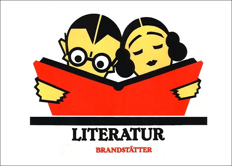
Fig. 9
Around six decades later, in the 1980s, this Kosel-motif re-appeared in a publishing company promotion. In this case it was for the Verlag Christian Brandstätter in Vienna (Fig. 9). Without any reference to the artist, the publisher printed, apparently using the Chicago variation of 1923, self-adhesive strips (15 x 18 cm) with the pair of readers and below them the names in block letters of the various categories of books they specialized in (Cultural History, Photography, Art History, Literature, Topography). Underneath it is the company name Brandstätter. Several decades later, the Kosel-trademark once again became visible in the book trade in Vienna.
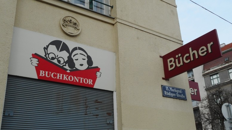
Fig. 10
In 2009, the Viennese bookseller Ulla Harms opened a shop called „Buchkontor“ on Kriemhildplatz in Vienna’s 15th district. In her search for an appropriate company logo she stumbled upon Hermann Kosel’s trademark for Rikola, the one with the two readers. Following an intensive „man-hunt“, she got in touch with Johanna Kosel, the widow of Hermann Kosel junior, and copyright owner. Harms purchased the right to use the old Rikola trademark and since then it has been used for various purposes, among them to brighten up the front side of the bookstore[4] (Fig. 10). It just goes to show that successful company trade marks can have a long life.
[1] For further details on the history of this publishing company see Murray G. Hall: Österreichische Verlagsgeschichte 1918–1938. Vol. II. Wien: Böhlau Verlag 1985, S. 310–357. Kosel’s work for the publisher Fiba-Verlag in Vienna is described in detail in: Hermann Kosel as book designer. His work for the publisher Fiba-Verlag, Vienna–Leipzig.
[2] See Hermann Kosel. The Holy every Day, S. 88. Fischmann‘s work was published as a serialized novel from 28 June to 14 September, 1921, in the Vienna daily Neues Wiener Tagblatt. Given the short space of time between the start of production and the appearance of the novel, we can assume that Rikola obtained the already printed work from another publisher.
[3] Nr. 6, 1923, Wien, 26. September 1923, S. 151.
[4] For further details on the company history etc. see www.buchkontor.at.