Cecil Dandridge, the advertising manager of the “London and North Eastern Railway of England and Scotland” (LNER), stated in an article on “English Pictorial Posters” that “a railroad company must develop an extensive advertising and must therefore consider carefully the means by which the desired attention of the public can best be obtained.”[1] The railroad company he represented had been created in 1923 by the Railway Act of 1921 as one of the four major companies in Great Britain and existed from the beginning of 1923 until the nationalization of the railroads at the end of 1947.
Frank Newbould, poster, c. 1929
During the interwar period the line’s first advertising manager, William Teasdale, and his successor, Cecil Dandridge, developed a highly professional advertising concept that soon became a model for the international tourism industry. From 1923 onwards, Teasdale, with the involvement of renowned graphic designers, focused on modernizing transport advertising and subsequently took an unusual measure to achieve this. In December 1926, he concluded contracts with the well-known British designers Austin Cooper, Frank Mason, Frank Newbould, Tom Purvis and Fred Taylor, which stipulated that the so-called “Big Five” were not allowed to work for any other railroad line than LNER in return for a corresponding basic fee.[2]
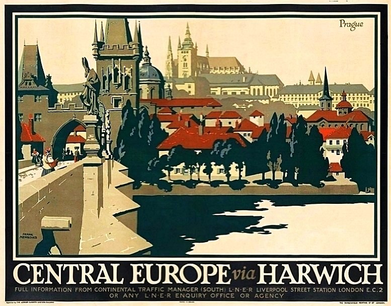
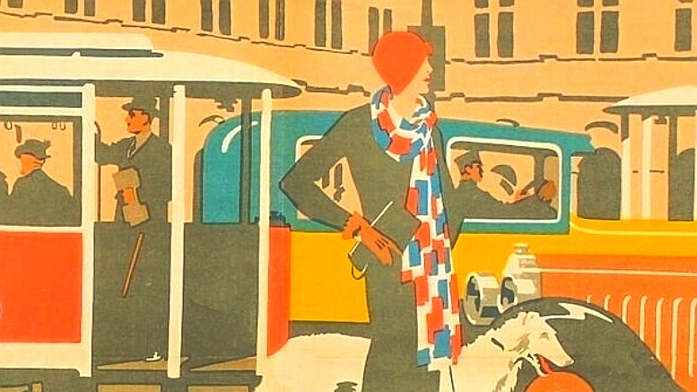
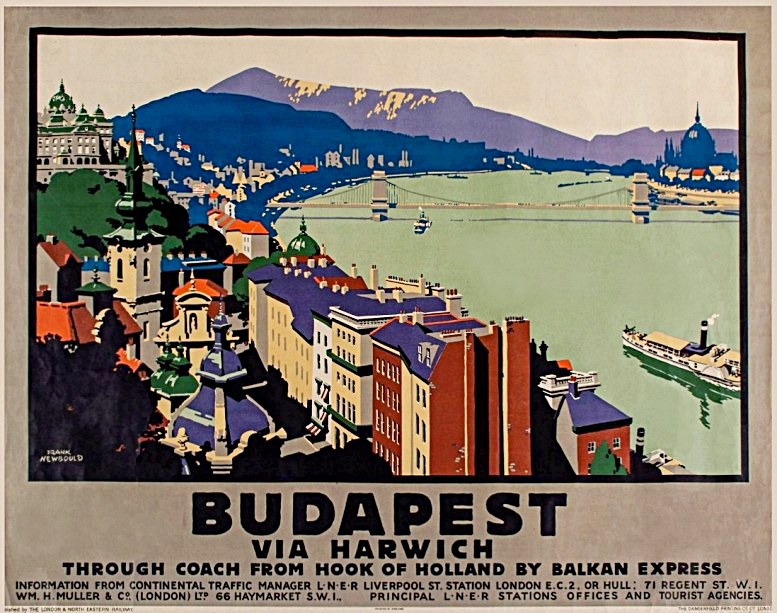
Frank Newbould, poster, c. 1929
From 1928, Cecil Dandridge was able to successfully continue the concept of his predecessor, who had become the company’s “Assistant General Manager”. Dandridge focused the advertising line even more strongly on a clearly accentuated look with a high recognition value. He determined that only one specific logo should be used in the entire advertising campaign and he chose “Gill Sans”, which had just been created in 1929, as LNER’s main typeface.[3] This gave the font a brilliant start, which contributed to its widespread use, which subsequently extended from British Railways to road signposts in the GDR.
Frank Newbould, poster, c. 1929
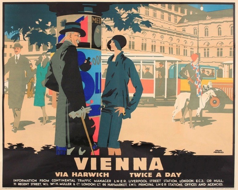
Part of the “London and North Eastern Railway’s” wide-ranging poster campaign was dedicated to the rail and ferry connection to Europe “via Harwich”. The port in the eastern English town belonged to the LNER and was intended to offer an attractive alternative to the Dover-Calais connection for journeys to Central Europe. As part of the LNER campaign, Frank Newbould (1887-1951) created posters for the destinations Prague, Budapest and Vienna. Newbould, who later also worked in the field of war propaganda during the Second World War, was in the tradition of the British “Beggarstaff Brothers”, who were among the main pioneers of modern graphic design.[4] These graphic designers achieved an outstanding effect by cleverly combining intensely colored areas. Newbould pursued a similar graphic concept, developing a sophistication typical of his work through the gradation of color intensities.
[1] Dandridge, C[ecil]: Englische Bildplakate, in: Knapp, Alfred [Ed.]: Reklame Propaganda Werbung. Ihre Weltorganisation, Berlin 1929, p. 118.
[2] Cole, Beverley: It’s Quicker By Rail. LNER Publicity and Posters, 1923 to 1947, Harrow 2006, p. 2.
[3] Frost, Lorna: Railway Posters, Oxford 2012, p. 27.
4] Rennie, Paul: Railway Safety Posters • Frank Newbould • British Rail • 1947, in: BAGDContext CSM, 29.4.2017,