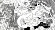
Many years ago, I first noticed Jianping He’s posters. The tripartite poster for Antalis (2005) is the first of his works that I remember vividly. He is also one of the designers whose work has been awarded and exhibited regularly at the competition “100 Beste Plakate”[1].
In 2006, Jianping He also won the “Plakat Kunst Hof Rüttenscheid Prize”[2], where we had the chance to meet in person. From that moment on, we stayed in touch. Time and again I would hear about his numerous projects. I soon realized that this was a person of many talents. Next to his design work for books and posters, he designed exhibition architectures and interior concepts for museums. Then he added a temporary teaching engagement at the Academy of Arts, where he also completed his doctoral thesis: a first extensive study on the history of Chinese posters[3].
Jianping He curates exhibitions, gives lectures, organizes cultural exchanges between German and Chinese students and runs design studios in both Hangzhou and Berlin … an impressive workload that obviously has not had any negative effect on his designs – quite the opposite: numerous prizes and awards here as well as abroad confirm the excellent quality of his exceptional imagery, most recently at the “Taiwan International Graphic Design Award” in 2019[4].
From the multitude of Jianping He’s fields of work, I will look at three in more detail. They are closest to my own work and form a kind of triad: surface, materiality and space. I will explore the particular aspects that I believe allow Jianping He to develop a fruitful interplay of seemingly different themes.
Surface
In regard to the treatment and design of surfaces in his poster work, Jianping He does not follow a singular pattern or approach. There is no signature style that immediately identifies a poster as Jianping He’s work, because his image-word creations are simply much too versatile. His portrait montages, however, are easily identifiable. Here, we can detect the repetition of a visual principle that is embodied in specific creations. We can see the results of these experiments in different variations.
Photography plays a central role in his choice of motifs, but rarely stands on its own. Most often photographs are distorted or layered, with altered colors or compositionally entwined with typography.
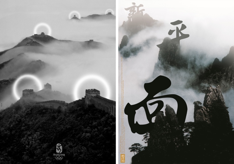
We often see nature imagery from his home region of Hangzhou – mostly mountain landscapes enveloped in clouds.
Typographical experiments are also a recurring theme. Some involve Chinese characters, others Latin letters; traditional techniques of calligraphy are sometimes applied to “our” realm of letters. Blendings and combinations like these can only be expected from someone who has a deep understanding of both worlds of scripture. Jianping He not only succeeds in joining them on a formal level, but also in regard to content, which continuously results in fascinating surfaces. This is why I consider his posters to be among the most important innovations of poster design in recent years.
Materiality
Traditionally, in China (as in Japan) the quality of the haptic is given significantly greater attention than here. There are various reasons for this. Since advertising with posters, for example, predominantly takes place in public indoor spaces such as arcades, train stations, and so on, people are often very close to the poster. They can notice what type of paper, printing technique and other special features such as embossing, metal foils etc. are used. Therefore, it is essential to support and reflect the creative idea in the choice of materials. The materials themselves, in turn, also represent certain properties. The complexity of this interplay defines the overall picture – this is true even for consumer products such as posters.
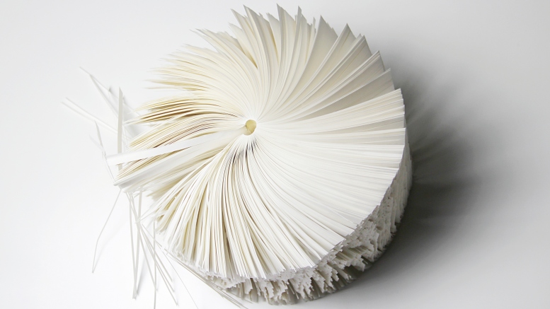
This connection becomes even clearer in book design. On the one hand, the books designed by Jianping He offer pragmatic usability, on the other hand they are also often book objects. For him, a book is more than just a collection of pages bound into a book block. Format, paper(s), printing technique(s), colors – everything is tuned to the content. Illustrations are separately printed and glued in; papers change from white to colored, or from thick to thin; intricate foldings open up new possibilities; the way it is cut requires careful use; sometimes there is drilling, or the book cut is colored to match an idea.
The packaging is also designed with great thought. Slip cases made of wood, carton, or fabric-covered carton; embossings, drillings and cut-outs; bare bindings and even sawn covers make each respective book exceptional. It thus receives much more attention and is marked much more pointedly as a three-dimensional object. What the eyes can see the hands become curious about – it makes you want to use it and experience it, feel and even smell it. And finally, you want to read the book as soon as the hands keep still enough to offer up the pages for reading.
This puts Jianping Hein the good company of the best Chinese and Japanese book designers of our days.
Space
That Jianping He also knows how to stage spaces is well-documented by his work as an exhibition architect. I first had the pleasure of experiencing it in 2011, when he organized the exhibition De Sein at the Hong Kong Design Center[5]. The rooms weren’t easy to make use of and the variety and diversity of the material was challenging. The resulting exhibition, however, gave the impression that the space had been designed exclusively for the show.
In 2015, Jianping He curated the first exhibition of Japanese graphic designer Shin Matsunaga in Mainland China, at the OCT Art & Design Gallery in Shenzhen[6]. The task at hand was again to present the multiplicity of a lifetime’s work. Along with the exhibits themselves, He’s use of light to set punctual highlights was, quite literally, one of my highlights.
That year we first worked together on the exhibition “Schriftbilder – Bilderschrift. Chinese Contemporary Graphic Design Exhibition”[7]. We were faced with the task of viewing, organizing, transporting and exhibiting the work of 50 designers. During the process I learned a lot about things that Jianping He sees from a Chinese perspective. Colors, structures, numbers – many things carry specific meaning, which is unknown to outsiders. And yet they influence and determine the exhibition’s structure and design. A subtext emerged, which Chinese visitors hopefully noticed.
Next to regularly curating exhibitions, Jianping He has also founded a gallery, the Center for Visual Arts Berlin, which is located directly adjacent to his studio[8]. It offers a new opportunity to experience Asian art and graphic design in Berlin.
Final thoughts
In my opinion, the distinctive character of Jianping He’s work is also rooted in his socialization in two cultures. He grew up in China, began studying there and then came to Germany to continue his studies here. He stayed in Berlin and quickly found his way into the structures here.
A “commuter” between two cultures essentially has two options: Either the person assimilates to the new culture, or they remain in their original world of thought, which leads to an existence in a kind of parallel society. Jianping He chose a more active path. He draws basic elements from Chinese (design) culture and brings them into contact with Western (design) culture. His “cultural citizenship” could perhaps be described as Euro-Chinese[9].
He puts the two worlds in relation to each other, while always marking where the contrast lies and where the common ground[10]. By playing with different elements, he always creates something new and surprising – in all areas of his work. Jianping He’s versatility can also be explained by the large repertoire of forms and ideas that he has, along with his ability to apply it in a continuously innovative, versatile and richly contrasting way. The poster for Antalis mentioned at the beginning is one such example: It draws its fascination from the large format, which is made up of micro-constructions that remain legible.
Added to this is his ability to express himself with a wide scope of artistic techniques – whether analogue or digital, historical or modern. It is this versatility that forms the essence of his work. The focus is on the desired result, while the objective determines the choice of media and means. These can range from traditional calligraphy, ink painting to photography, real and photo-montage, digital image processing or typographic experiments.
Looking at Jianping He’s oeuvre, the first thing that stands out is the diversity of the themes he works on and the universality of these themes. In addition, the quality of the work he offers in so many areas is remarkable. He draws from a variety of Chinese and European sources, which he continually combines in new ways. I am sure that the balancing act of operating between cultures can be quite exhausting on the one hand, but on the other hand, I am also sure that Jianping He’s talent to put this into use also explains the extraordinary scope of his success. Without calculation, he joins the ranks of universal artists, as they were successful in Germany and Austria at the beginning of the 20th century.[11]
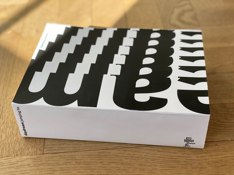
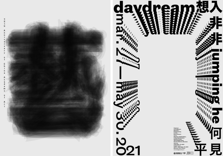
“René Grohnert: Surface – Materiality – Space. On Multiplicity – a Plea”, article for the catalogue on the occasion of the exhibition „daydream – jumping he“, Sea World Culture and Arts Center, Shenzen, March 27 – May 30, 2021.
[1] The competition “100 Beste Plakate” (the 100 best posters) has been held since 1966. Since 2001 it has been organized by the Berlin-based association 100 Beste Plakate e.V. Since then, posters from Germany, Austria and Switzerland have also been included in the competition. Between 2004 and 2018, a total of 16 posters by Jianping He were awarded in the competition for the 100 best posters from Germany, Austria and Switzerland. Since 2006, the exhibition has also been shown at the Deutsches Plakat Museum in Essen.
[2] The “Plakat Kunst Hof Rüttenscheid” (poster art yard Rüttenscheid) was founded in Essen in 1995 at the initiative of Feliks Büttner and Viktor Seroneit (1946-2011). The aim was to support the Deutsches Plakat Museum and to promote international exchange with the graphic design scene. Poster competitions and award ceremonies were central activities in this context. Well-known designers were among the prize winners: 1998: Niklaus Troxler; 1999: Pierre Bernard / Vivian Harder; 2000: Waldemar Swierzy; 2001: Volker Pfüller; 2002: David Tartakover; 2003: Kari Pippo; 2004: Melchior Imboden; 2005: Anette Lenz; 2006: Jianping He; 2007: Istvan Orosz; 2008: Mieczyslaw Wasilewski; 2009: Alain Le Quernec; 2010: Stephan Bundi; 2011: Malte Martin.
[3] Jianping He: Entwicklungsgeschichte des Plakates in China: Anfang 19. Jahrhundert bis Ende Kulturrevolution, (The development history of the poster in China: from the early 19th century to the Cultural Revolution), Berlin 2012.
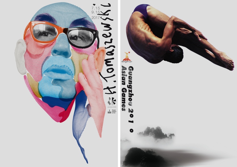
[4] Jianping He received the Gold Award for Design for the design of a book on Henryk Tomaszewski, Shanghai 2017.
[5] “De Sein: German Graphic Design from Postwar to Present”, Hong Kong Design Center, November 2011. The rooms which presented the three main categories were bathed in the colors of the German flag. The black room presented corporate design, the red room posters, the gold room books.
[6] “Shin Matsunaga – The Three Meter Radius”, OCT Art & Design Gallery, Shenzhen. Oktober–November 2015.
[7] “Schriftbilder – Bilderschrift. Chinesisches Plakat- und Buchdesign heute”, Museum Folkwang, June-July 2016. The second stop in June 2017 was the Berliner Kunstbibliothek (Berlin art library), followed by the historic building of the Hamburg Chamber of Industry and Commerce.
[8] The gallery opened in December 2019 with the exhibition “Hideki Nakajima: Made in Japan”. Tokyo.
[9] In reference to a statement made by designer Henry Steiner: “I have lived in Hong Kong fifty years […]. In terms of ‘cultural citizenship’ my sensibilities are broadly Euro/British” See: Henry Steiner: “A very ‘weanerisch’ Sensibility”, Henry Steiner in conversation with Jianping He.
[10] René Grohnert: The distant so close – Posters by Jianping He. In: ggg (ed.): Flash Back, Tokio 2012, p. 12.
[11] The plethora of themes that Jianping has worked on remind me, for example, of Koloman Moser (1868-1918) and Emil Pirchan (1884-1957), who also created within broad artistic fields. See, a.o: Christoph Thun-Hohenstein – Christian Witt-Döring – Elisabeth Schmuttermeier (ed.): Koloman Moser: Universal Artist between Gustav Klimt and Josef Hoffmann, Basel 2019, or: Beat Steffan (ed.): Emil Pirchan. Ein Universalkünstler des 20. Jahrhunderts, Wädenswil 2017.