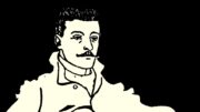
Over the years, many names have become inseparably associated with the Berliner Ensemble. Bertolt Brecht. Helene Weigel, and Heiner Müller are just a few of them. The list dons many memorable names: John Heartfield, Karl von Appen, and of course we can’t go without mentioning Karl-Heinz Drescher.
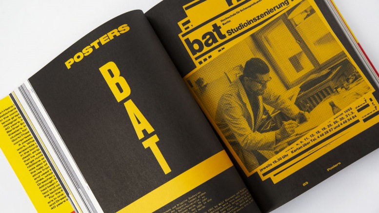
When Karl-Heinz Drescher joined the Berliner Ensemble in 1962 as a theater graphic designer, it was certainly not foreseeable that he would work for the BE for nearly forty years. His oeuvre of almost 400 posters for the Ensemble was mostly created here and has had a lasting impact on the visual branding of the institution. In this way, Drescher has been lucky to establish himself in a niche of his own making. Unlike others, he was able to do so without becoming a recluse expert. Instead, his standing served him as a safe starting point to further explore his interests, as well as a benchmark by which to judge his efforts.
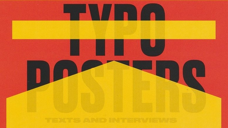
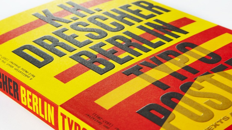
Although there are already some comprehensive publications on this subject, this book is an important enrichment. It illuminates an essential part of Drescher’s poster work much more intensely than previously done: his use of typography.
The “initial spark” – as he called it – was a commission from stage designer von Appen, who needed a notice for a performance in the style of the Parisian public announcements of 1789.Through this task, Drescher gained an intensive interest in the typeface poster. What is particularly remarkable is that he tried to renew and cultivate the most original form of poster printing – printing with wood type. The result of this was a certain severity and peculiarity in his design, as though it came from a different time. While poster design in general tended towards association, i.e. one did not read the posters but merely grasped the most visible message, Drescher perfected the medium and made the poster primarily a source of information rather than emotion. For this reason, his posters, especially when they were surrounded by colorful and illustrated works, stood out in a quiet, restrained manner. This effect made his work singular among its flashy peers.
Markedly, this was not only because the strictness of his letters became the trademark of the BE, but because they conveyed that what was being advertised – the theater – deserved the full attention of the viewer.
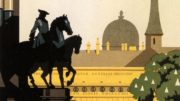
When put in the context of poster history, it becomes clear that K.H. Drescher made use of the formal language of a wide span of times and ideas. First, we recognize the posters of the 17th and 18th centuries. These were all printed via letterpress, i.e. the individual letters made of lead, the larger ones made of wood, which were joined to form words and sentences and held together in a single frame. Any ornaments, such as lines, beams or the rarer pictorial reflections, had to be produced as a printing block. Thus, the equipment of the respective print shop with different fonts ultimately determined the appearance of the printed products. This artisanal approach to printing produced a relatively uniform result, especially since the posters were printed in black for the most part, at best on colored paper. Desired colorings had to be done manually and were reserved for special occasions. With the introduction of color lithography in poster production from the middle of the 19th century, the text in the poster lost its significance in favor of the now full color image. It was not until the 1920s that New Typography began to draw new attention to typography as a means of design, and, more significantly, as a means of structuring a layout. Bedeutungsperspektive or status perspective, known from medieval painting (the size of the represented characters is not determined by their actual distance from the observer but rather by their status), seems to celebrate its return in the realm of typography. Surely, the fascinatingly plain way the Russian avant-garde, the Rosta windows, frugally applied typography in their propaganda posters was not lost on Drescher.
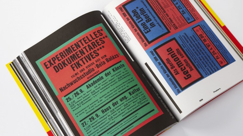
To place his posters in this tradition is certainly appropriate, not just due to Drescher’s own persistent pursuit of quality over the decades. unaffected by fads and fashions. His almost obsessive search for variants and variations of the use of typography guided his direction. Both historical and contemporary examples formed his perception and inspired him in his search for something that was new and entirely his. Through this process, he also developed a strong interest in wood, lead, and brass type as printing objects.
His way of designing also had “collateral benefits”, so to speak. On the one hand, it allowed him to escape the eternal discussion about so-called Socialist Realism, the art doctrine of the time. On the other hand, he was less dependent on the technical ups and downs of printing capabilities. For most print runs it was unusual to use more than one color, rare to use two, and almost unheard of to print with more than that, not to mention on colored paper. When the computer became an established tool of the design world in the early to mid-1990s, it transformed Drescher’s perspective on production just as much as that of his peers. The design world wasn’t the only one that was changed dramatically, however. the Berliner Ensemble was forced to restructure and change direction after German reunification. This new Berliner Ensemble had no room for a full-time, in-house theater graphic artist – so Drescher’s employment ended abruptly in 1999. What will remain of that legacy? The posters will. They give us an idea of how the Berliner Ensemble wanted to be perceived by the public. They also give us an impression of Drescher’s path – a designer pursuing his work for so many years in the interest of the theater. And they teach us how effective typography is in this endeavor.
Translation: Anh Quynh Lengoc
First published in:
Lange, Markus: K.H. Drescher – Berlin Typo Posters, Texts and Interviews. Eine Publikation über den Gestalter / A Publication About the Designer – Karl-Heinz Drescher (1937–2011), Slanted Publishers, Karlsruhe 2020.